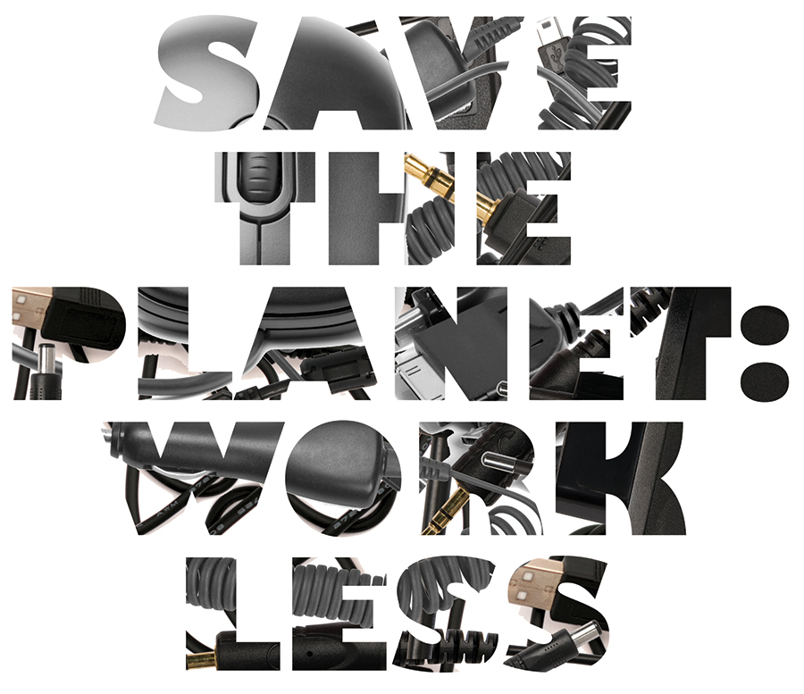
Here's an alternative typography treatment I put together for the SF Bay Guardian's April 16 cover. This version features a pattern of common energy-draining devices, which emphasize technology's harmful effect on Earth's resources.
We ended up going a different route to avoid looking too similar to the previous week's Careers + Ed cover, which also featured large black type against a white background. But I'm hoping to use this same idea — a pattern emerging from a white background to form letters — again soon.
Stay tuned. And, er, unplug. Save the planet, remember?