It was hard to go wrong with this photo of Justin Vivian Bond.
The geometric typography treatment, inspired by V's earring, adds a bit of elegant fun. But V's eyes, lips, and outfit are the real stars.
Read the interview here.
It was hard to go wrong with this photo of Justin Vivian Bond.
The geometric typography treatment, inspired by V's earring, adds a bit of elegant fun. But V's eyes, lips, and outfit are the real stars.
Read the interview here.

Illustrator Patrick Sean Gibson took over the SF Bay Guardian cover this week, with fabulous results. I've never had an illustrator ask to hand-letter not only the main headline and subhead, but the masthead, issue info, and teaser heds as well. He wanted to make the whole cover consistent with the illustration, and I'm super into the effect.
For the 2014 edition of the annual Streets Issue, we wanted to convey the busy, lively, colorful feeling of traveling around SF streets without creating a too-busy Where's Waldo scene. Using a 1969 Time magazine cover by Milton Glaser as inspiration, we picked out a few common street scenes and iconic architecture, and Patrick swirled them together with '70s colors and a '70s typography treatment.
Maybe it's just because it hit stands today, I can't stop looking at it, and I've been getting tons of compliments ... but I'll go ahead and say this is one of my favorite Bay Guardian covers I've worked on.

Guardian illustration by Patrick Sean Gibson
Now that you've stared at it sufficiently (but feel free to go back and look again), check out the Streets Issue online.
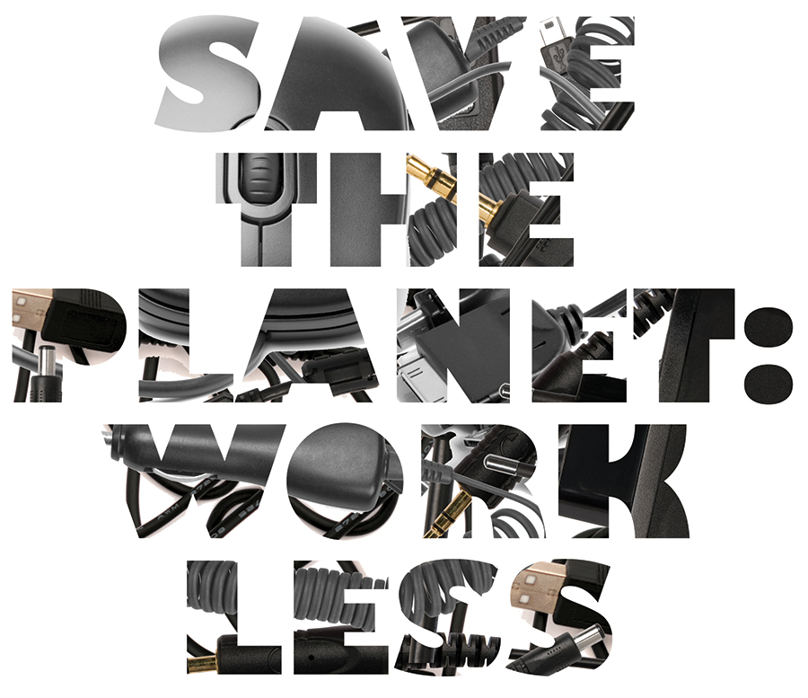
Here's an alternative typography treatment I put together for the SF Bay Guardian's April 16 cover. This version features a pattern of common energy-draining devices, which emphasize technology's harmful effect on Earth's resources.
We ended up going a different route to avoid looking too similar to the previous week's Careers + Ed cover, which also featured large black type against a white background. But I'm hoping to use this same idea — a pattern emerging from a white background to form letters — again soon.
Stay tuned. And, er, unplug. Save the planet, remember?
This anonymous clip-art genius stole my idea for making my own typography.
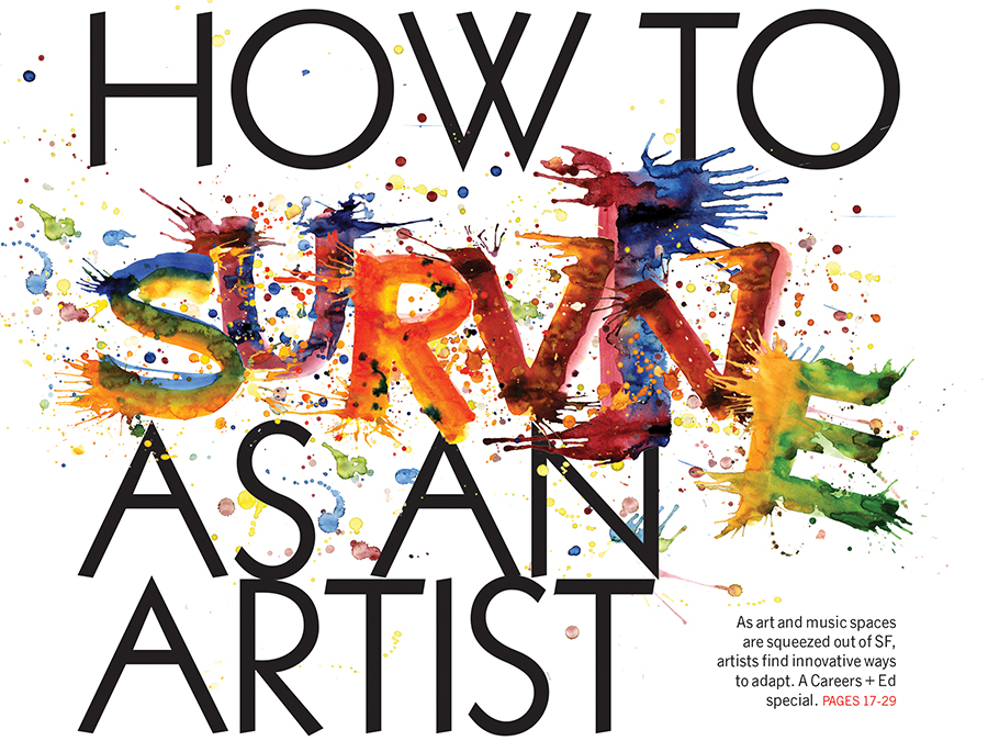
I wish I could use multicolored paint-splatter type every week.
Check out this week's Careers + Ed issue.
This cover concept stemmed from a bad piece of clip-art I saw. While the basic idea is the same — a circle of hands around a home — I had a lot of fun transforming that concept into something both beautiful and relevant.
The hand outline conveys individual openness and vulnerability, while the multicolored, transparent layering conveys unity, diversity, and strength in numbers — in addition to providing a fun, colorful visual element.
Using a multiunit building helps focus the discussion on tenants instead of owners, and the architecture is reminiscent of San Francisco homes.
And yes, I used the font sail again. I think we can all agree it's perfect.
Read the cover story here.

Remember a few weeks ago when I said I was obsessed with the font Sail?
Here's another example: the cover I designed teasing the SF Bay Guardian's July 2013 article on the America's Cup, comparing sailing culture in the U.S. with sailing culture in New Zealand.
Go ahead and get lost in the curves of that beautiful typography against a background of sail forms.

This week's SF Bay Guardian cover story highlights the life and work of local painter Sylvia Fein, who, at 94 years old, is continuing to create some of the best work of her career.
I can only hope that when I reach 94, I'm as passionate, thoughtful and open to the world as Fein is.

"Black Eye," 2008, egg tempera on board, 5x7 inches, courtesy of artist Sylvia Fein and the Krowswork Gallery
To emphasize the secretive feel of the artwork and headline, I used two versions of the same typography — one in black and one in white — and edged the white out from underneath the black so that it's instantly legible, but has a hidden, mysterious quality.
Click here to download the font, "Sail," which is free for commercial use. (I'm kind of obsessed with it.)