• Product Design + Strategy
  • Brand + Creative Direction
  • Writing
  • About

Brooke Ginnard

  • Product Design + Strategy
  • Brand + Creative Direction
  • Writing
  • About

#FlashbackFriday: Let It Bleed

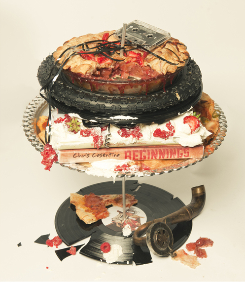
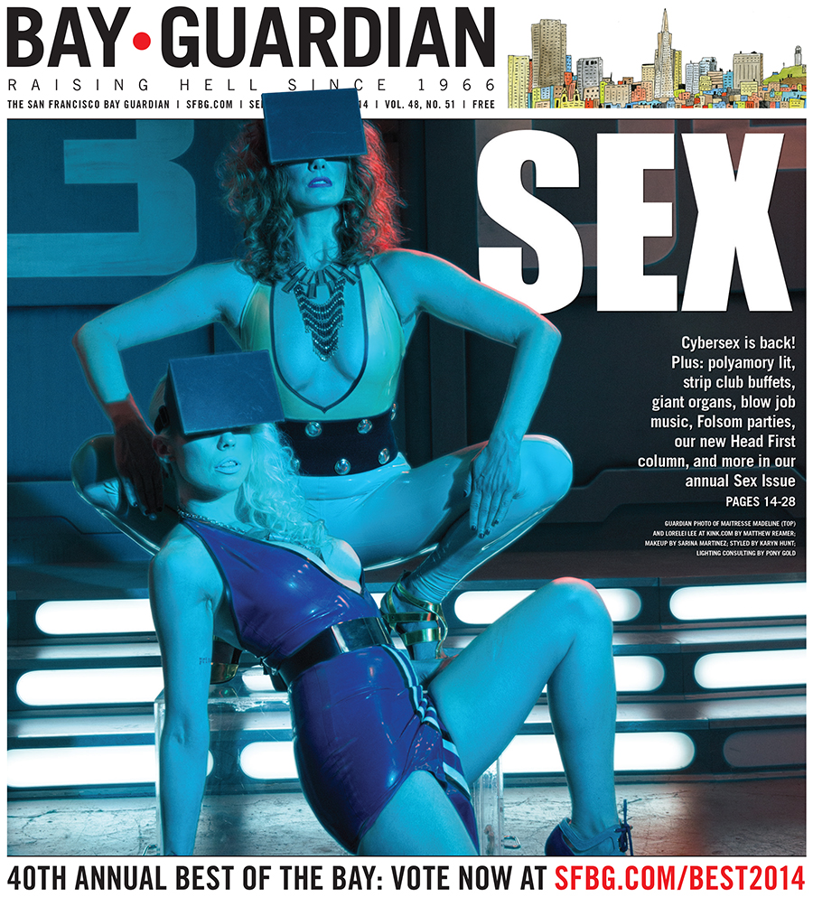
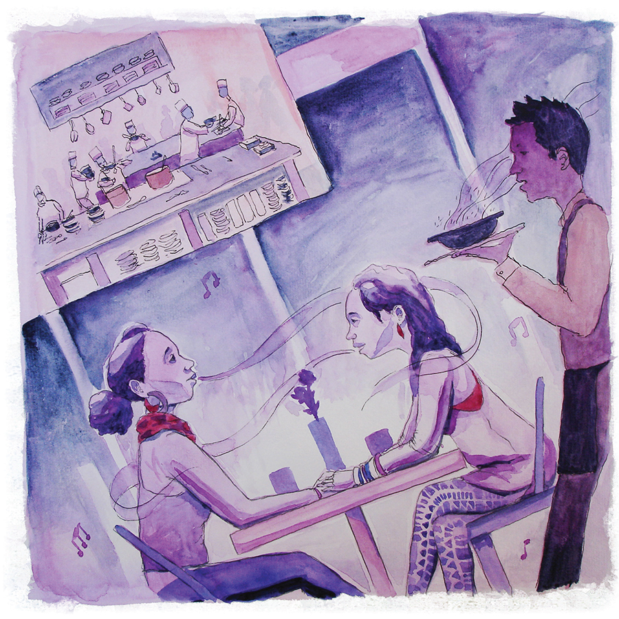
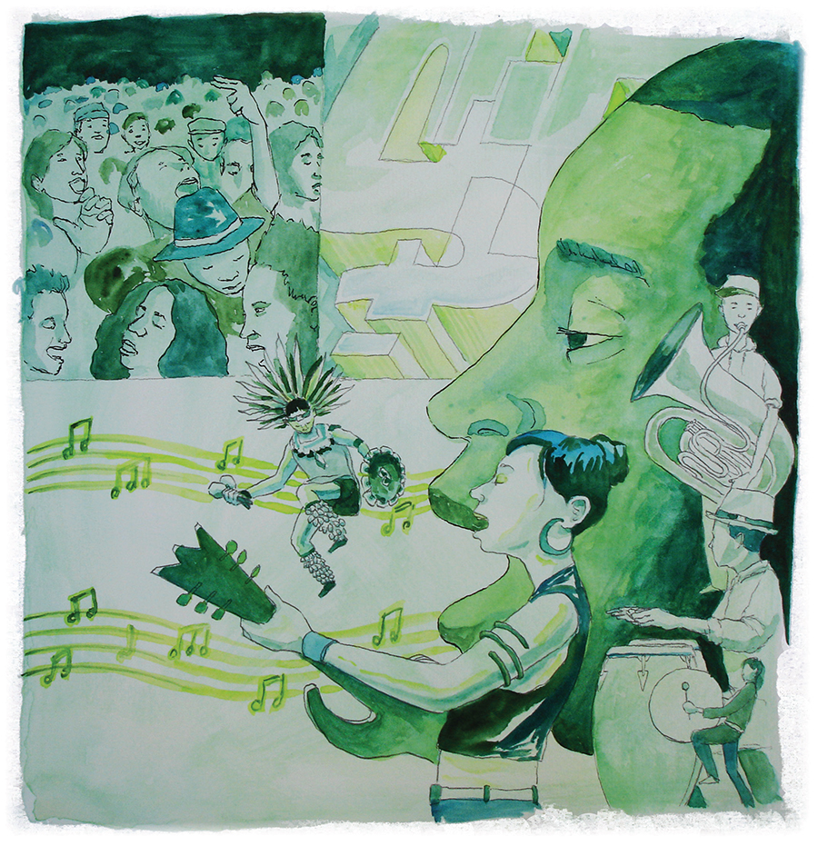
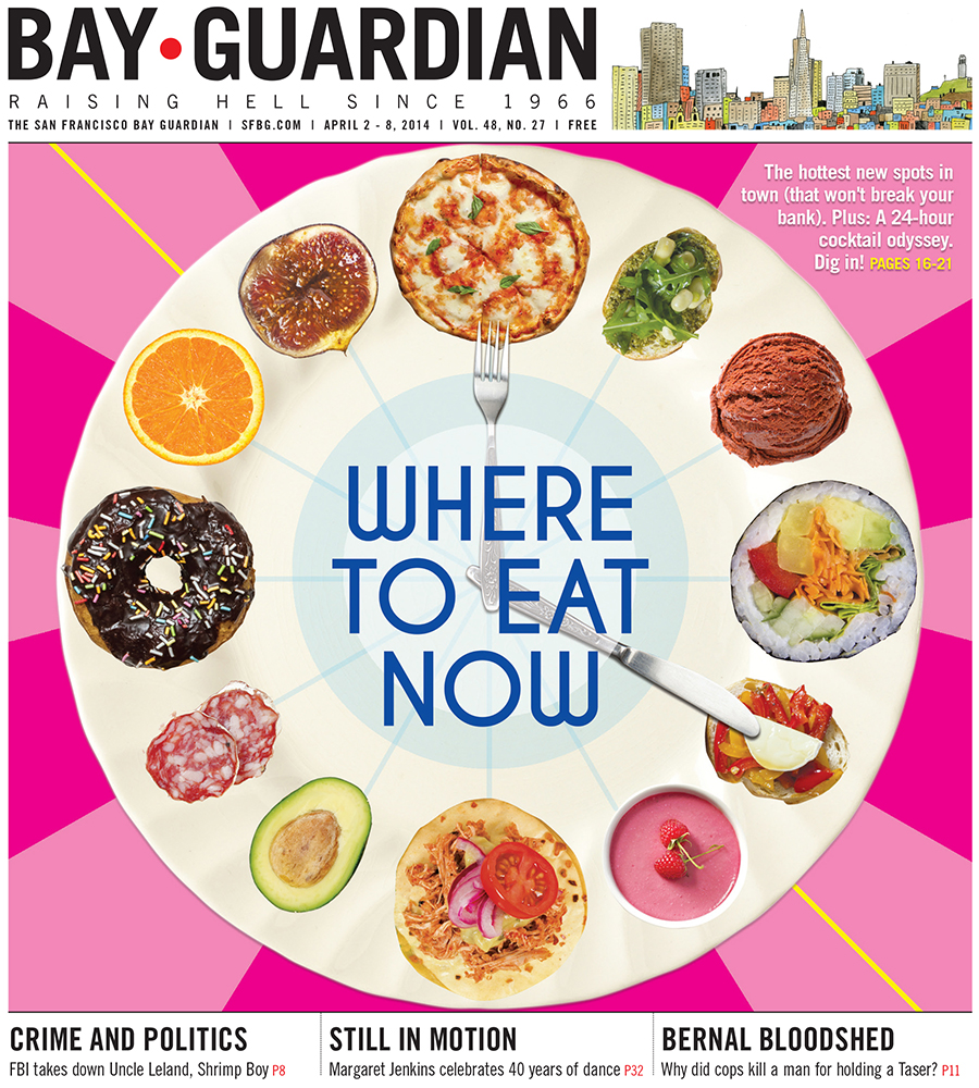
The SF Bay Guardian's Music + Food issue was the first SFBG cover shoot I had fully conceptualized, planned, directed and styled after the transition period with former art director Mirissa Neff had ended, and I'm still really proud of it.

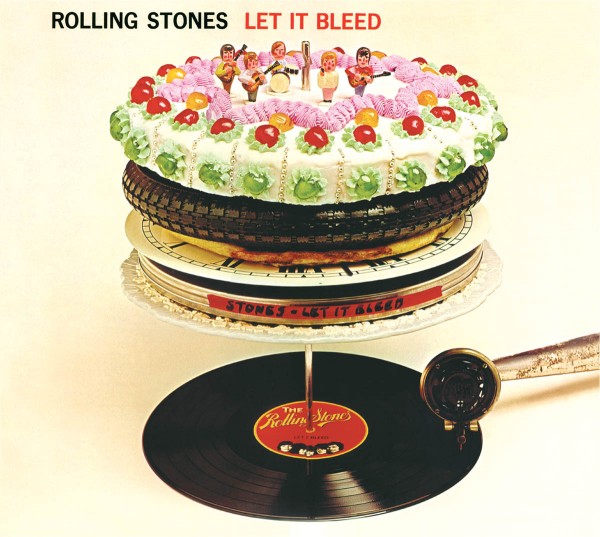
The shoot itself was chaotic yet creative, with photographer Matthew Reamer and myself troubleshooting late at night, in real time at his Mission studio to make sure we had the right setup with the right props to best reflect a modern, San Francisco-focused version of the Rolling Stones' Let It Bleed album cover... 

It was definitely my first time running and directing a shoot, and I had a lot to learn. Looking back now, I would have kicked myself for not having sketched out how I wanted everything to look —even if we in the moment decided to stray from the plan, as some of the best work often does. 

But the creative energy and on-the-spot design and construction was so inspiring, and made me realize exactly how much I was going to love this new job.

Walking home after the shoot, after having selected the final photos that would be on the cover and also printed inside with the article, slice of late-night pizza in hand, is still the moment that epitomizes satisfaction for me.

(But yes, the pizza was a leftover prop from the shoot... and yes, I guess that's at least a little bit gross.)

Let_It_Bleed_1.jpg
Let_It_Bleed_2.jpg
tags: photoshoot, SF Bay Guardian, music, cover
Friday 02.10.17
Posted by Brooke Ginnard
 

Death is not the end

Yesterday, on the morning after we sent the SF Bay Guardian's 40th annual Best of the Bay issue to press, staff were informed that the 48-year-old alternative weekly — "raising hell since 1966" — would be shut down effective immediately.

There's still a lot to process. Many things, including how to handle the paper's storied archives —online and in print — still need to be sorted out between the owners, the staff and the community. 

I'm sad, obviously. But I'm glad that the SF Bay Guardian's last issue (at least in this incarnation) is a great one. 

Publisher/Executive Editor Marke B. and I worked with local legend Jeremy Fish for this year's Best of the Bay artwork. Fish being Fish, I gave him very little art direction aside from the issue's theme (ironically Día de los Muertos, more on that below) and the four categories in which we give awards (City Living, Food+Drink, Arts+Entertainment, and Shopping). Per usual, Fish killed it, making this not only one of the most exciting issues I've worked on, but one of the easiest covers I've ever produced.

The Best of the Bay issue hits stands today, so go to your nearest SFBG newsstand, pick up a copy, admire Jeremy Fish's insane talent, and read about all of the reasons why we love San Francisco and the Bay Area. See Fish's artwork below, and scroll to the bottom to check out the entire paper on ISSUU.

I'll end with some all too relevant words from Marke B.'s introduction to Best of the Bay, on why we chose Día de los Muertos as this year's theme:

Lately when it comes to the Bay Area, "change" has been the dominant subject of conversation — especially in terms of what's been lost in arts, industry, creative types, and overall freak factor. But change can be a great positive motivator, and in celebrating the things no longer with us, we keep their spirits alive — and at the ready to help us embrace new beginnings.

JeremyFish_cover
JeremyFish_cityliving
JeremyFish_fooddrink
JeremyFish_AE
JeremyFish_shopping

Scroll through the entire 40th annual Best of the Bay edition, the SF Bay Guardian's last issue:

tags: SF Bay Guardian, Best of the Bay, Jeremy Fish, cover, illustration, art direction, Día de los Muertos
Wednesday 10.15.14
Posted by Brooke Ginnard
Comments: 2
 

My virtual reality is made from cardboard

For the SF Bay Guardian's annual Sex Issue, we decided to base our 2014 cover shoot on our cybersex story, and go with a TRON-esque setup (inspired by Playboy's 2010 tribute) with Virtual Reality headsets, à la Oculus Rift.

We immediately found two perfect models: dominatrixes Maitresse Madeline and Lorelei Lei at Kink.com, which kindly allowed us to stage the photo shoot in Kink's Battlestar Galactica space at the San Francisco Armory. (Sidenote: Kink has the most amazing prop closet I've ever seen!)

And photographer Matthew Reamer took care of the blue and red lighting to perfection.

But I ran into problems finding an Oculus Rift VR headset that would be available during our scheduled photo shoot. After looking at a few VR spoofs online, I decided to make my own with cardboard, goggles, and spray paint:

I think my fake headsets translated pretty well in the final cover:

Guardian photo of Maitresse Madeline (top) and Lorelei Lee by Matthew Reamer

Guardian photo of Maitresse Madeline (top) and Lorelei Lee by Matthew Reamer

Here's a behind-the-scenes shot from the photo shoot, courtesy of Matthew Reamer:

From left: Maitresse Madeline, Eleanor Bleier, Matthew Reamer, Pony Gold, Lorelei Lee, Brooke Ginnard

From left: Maitresse Madeline, Eleanor Bleier, Matthew Reamer, Pony Gold, Lorelei Lee, Brooke Ginnard

tags: SF Bay Guardian, sex, virtual reality, photoshoot, behind the scenes, Matthew Reamer, Playboy, cover, make
Friday 09.26.14
Posted by Brooke Ginnard
 

Pumping iron + smoking weed

Things I learned on the photo shoot for the SF Bay Guardian's Pot Olympics cover: 

1. The secret to staying young is exercising every day (especially skiing in the winter and hiking and/or playing volleyball in the summer) and smoking weed.

2. With the right equipment, my apartment (specifically the central space connecting my kitchen, living room and bedroom) can be transformed into a photo studio.

3. If you put your energy into doing the things that you love, everything will be OK.

4. Everyone has a cannabis card.

5. My neighbors do not care if the hallway smells like weed for an entire day.

6. Michael Keeney is a fantastic photographer. (But I already knew that.) 

7. Medium is a hell of a show.

Guardian photo of Brad Olsen by Michael Keeney

Guardian photo of Brad Olsen by Michael Keeney

Read the story here; flip through the full issue here.

tags: SF Bay Guardian, cover, photoshoot, photography, Michael Keeney, Brad Olsen, marijuana, Medium
Wednesday 09.10.14
Posted by Brooke Ginnard
 

Burning Man jumps the shark

As soon as the phrase "Burning Man has jumped the shark" started being thrown around earlier this year, an image of the man on waterskis popped into my head, and I campaigned for SF Bay Guardian editor / Burning Man author Steven T. Jones to write a cover story.

I felt like a collage lent itself really well to the surreal image I had in mind, as well as the basic logistics of the festival itself — people and art appearing in and then eventually disappearing from the desert, leaving no trace.

I scoured a small collection of magazines for a mix of desert and ocean hues, and tore those pages into smaller pieces that focused on color and pattern, leaving behind only a hint of the original image. I then arranged those pieces on my living room floor. Instead of gluing them down for a more manicured look, I let the pieces curl and create depth and shadows.

After photographing the physical collage, I used Photoshop to insert images from Burning Mans past into the desert portion. I also used the software to add a man on skis, and a shark for him to jump over, à la Fonzie. 

Collage using torn magazines, AP file photos, and clip art.

Collage using torn magazines, AP file photos, and clip art.

tags: SF Bay Guardian, cover, collage, Burning Man, Photoshop
Tuesday 08.19.14
Posted by Brooke Ginnard
 

Nude beaches

For the SF Bay Guardian's 40th annual Nude Beaches issue, I decided to transform an iconic nude image — Michelangelo's David — into a nude beachgoing bro.

I used Photoshop to transform the statue into a sand sculpture, and added modern neon props and colorful light leaks resembling an Instagram filter for a cover that's both a humorous allusion to an iconic work of art, and a parody on hipster culture. 

I had SO MUCH FUN transforming iconic works of art in Photoshop ... despite the fact that putting a beer can in David's hand may be one of the most despicable things I've ever done. 

WARNING: Past Nude Beaches cover photos, displayed at the end of this post, contain full-frontal nudity and are not safe for work.

4845-cover_NudeBeaches.jpg

Below are the cover photos from the past two years, both photographed by Matthew Reamer. (WARNING: NSFW!)

For the 2013 issue, I decided to experiment with nude typography. I gathered a group of friends (and friends of friends) to spell out the word "NUDE" on San Francisco's Baker Beach (the nude-friendly end, obviously), then used Photoshop to superimpose "BEACHES" on the sand below them.

The 2012 issue featured a photo of three people hanging out (literally) (sorry) at Baker Beach. It was the first time in the Guardian's history we were allowed to feature a penis on the cover, and we took full advantage. The cover photo attracted attention from Jezebel, whose online commenters also applauded us for featuring beautiful, real bodies.

Fun fact: The 2012 nude beaches shoot was the first photo shoot I ever coordinated for the SF Bay Guardian.

Photo by Matthew Reamer

Photo by Matthew Reamer

Photo by Matthew Reamer

Photo by Matthew Reamer

tags: SF Bay Guardian, Nude Beaches, Matthew Reamer, photography, photoshoot, Photoshop, cover, Jezebel
Tuesday 08.05.14
Posted by Brooke Ginnard
 

Life and death at SF General

Matthew Fleming makes my job insanely easy.

I literally asked him to do a hospital illustration that conveyed a lot of interconnected activity — ambulances traveling, IVs, beds, nurses, mental health care, bandages — and that would include a big human heart for me to superimpose a headline on.

And then this happened, with no further direction:

Matthew Fleming, you're amazing. Also check out the tech cover he illustrated for me last year.

tags: Matthew Fleming, SF Bay Guardian, cover, illustration, art direction, hospital, SF General
Wednesday 07.30.14
Posted by Brooke Ginnard
 

Vacation rush

I recently returned to work after spending two wonderful weeks in Italy and France. I ate to my heart's content, swam in the Mediterranean, read three books, and drank a lot of wine. But to get to that state of relaxation, I had to frantically work ahead before I left. 

Thankfully someone took over layout and art request duties during my absence, but I didn't want to leave without putting together two covers that would run during my absence.

The first cover (which ran second) was for a story about defining the brogrammer and exploring diversity in tech. Since the article's concept was still developing, I wanted to come up with a cover image that was on-point, but still universal enough to capture the changing direction of the piece. 

Hence: the cloud heads. The cloud-head concept works in three ways: 
1. Most tech workers literally work in the cloud. 
2. Brogrammers have their "heads in the clouds" and are out of touch with most peoples' realities of life in San Francisco.
3. The vast majority of tech workers are white males.

I put the cloud heads in front of a mechanical-looking SF skyline. (Thank you, Photoshop filters.) I think I nailed it.

01-Cover_techbro.jpg

This next cover, which ran the first week I was gone, was for a replacement story that I ended up putting together at the very last minute. 

We originally planned to run a feature on SF General hospital that week, and I had commissioned a beautiful illustration for the cover far in advance. However, the writer determined that she needed more time for the piece, so it was shelved in favor of a story on Recology's shady practices. (The SF General cover hits stands tomorrow, so stay tuned!)

The Recology story was originally pitched as being purely about compost, and I decided this would be a good opportunity to write on a banana — a growing desire produced by Jason Polan's Instagram feed.

When the piece became more elaborate, I incorporated all waste bins — compost, recycling and garbage — in a background resembling the look of an online game, in order to fit with the story's updated headline.

tags: SF Bay Guardian, cover, collage, banana, Photoshop, tech, Jason Polan
Tuesday 07.29.14
Posted by Brooke Ginnard
 

Good golly, Miss Ronnie

For the SF Bay Guardian's July 2 issue, I used a sassy file photo of Ronnie Spector from the '60s, plus a sassy typography treatment in summery colors for a cover that's both classic and playful ... in addition to showing off Ronnie's (wait for it) sass.

Read Emma Silvers' story on the original bad girl of rock 'n' roll here.

tags: Ronnie Spector, sail, SF Bay Guardian, cover, photography
Tuesday 07.29.14
Posted by Brooke Ginnard
 

2014 AAN Awards

Today I found out I'm a finalist in the Association of Alternative Newsmedia's 2014 awards for cover design!!! Check me out. 

Below are the three SF Bay Guardian covers I submitted for the entry.

In all of these designs, I relied heavily on physically making (with paper, an X-Acto knife, paint, gemstones) or staging (board-game pieces, my own fist), then photographing the elements and adding some digital touches in Photoshop. 

I haven't seen the other finalists' work (the website has not yet been updated with design submissions), but I'm hoping this hands-on approach gives me an edge.

Send winning vibes my way! (But honestly, I'm super stoked on being a finalist. Still pinching myself!)

Airbnb cover for the SF Bay Guardian, Aug. 7, 2013

Airbnb cover for the SF Bay Guardian, Aug. 7, 2013

Foreclosures cover for the SF Bay Guardian, Sept. 4, 2013

Foreclosures cover for the SF Bay Guardian, Sept. 4, 2013

Queer gaming cover for the SF Bay Guardian, Oct. 23, 2013

Queer gaming cover for the SF Bay Guardian, Oct. 23, 2013

tags: SF Bay Guardian, cover, Photoshop, AAN, Association of Alternative Newsmedia, make, paper
Wednesday 06.18.14
Posted by Brooke Ginnard
Comments: 1
 

Elemental Romance

It was hard to go wrong with this photo of Justin Vivian Bond.

The geometric typography treatment, inspired by V's earring, adds a bit of elegant fun. But V's eyes, lips, and outfit are the real stars.

Read the interview here.

tags: SF Bay Guardian, cover, typography, Justin Vivian Bond
Wednesday 06.18.14
Posted by Brooke Ginnard
 

Furqan's First Flat Top

Robert Trujillo, the mega-talented local artist I worked with for the SF Bay Guardian's 2013 Best of the Bay issue, is making a children's book! 

Please check out his Kickstarter page, and contribute if you can. 

Cover illustration for the SF Bay Guardian's 2013 Best of the Bay edition by Robert Trujillo

Cover illustration for the SF Bay Guardian's 2013 Best of the Bay edition by Robert Trujillo

City Living illustration for the SF Bay Guardian's 2013 Best of the Bay edition by Robert Trujillo

City Living illustration for the SF Bay Guardian's 2013 Best of the Bay edition by Robert Trujillo

Food + Drink illustration for the SF Bay Guardian's 2013 Best of the Bay edition by Robert Trujillo

Food + Drink illustration for the SF Bay Guardian's 2013 Best of the Bay edition by Robert Trujillo

Arts + Entertainment illustration for the SF Bay Guardian's 2013 Best of the Bay edition by Robert Trujillo

Arts + Entertainment illustration for the SF Bay Guardian's 2013 Best of the Bay edition by Robert Trujillo

Shopping illustration for the SF Bay Guardian's 2013 Best of the Bay edition by Robert Trujillo

Shopping illustration for the SF Bay Guardian's 2013 Best of the Bay edition by Robert Trujillo

tags: Robert Trujillo, SF Bay Guardian, cover, children's book, kickstarter, illustration, handlettering, Best of the Bay
Monday 06.16.14
Posted by Brooke Ginnard
 

The treat sheet

I love this cover. It popped out of the stands. It's fun, summery, sweet, and really makes you want an ice cream cone. AND it was easy to make. 

Step 1: Find adorable photo of little girl eating an ice cream cone on your photo subscription service; realize that you have to find a way to use this image.

Step 2: Purchase a delectable ice cream cone from a local company that you want to feature in an upcoming food issue. (In this case, it's two scoops of lemon cookie and strawberry ice creams on a waffle cone from Three Twins — still highly recommended.)

Step 3: Hold cone, and have a partner photograph it.

Step 4: Eat ice cream. (My favorite part.)

Step 5: Use Photoshop to substitute the original boring ice cream cone with a photo of your delicious, locally made, publication-reviewed ice cream.

Step 6: Add a pink background, a snazzy headline font (yes, that's sail), and a subhead in a colorful geometric shape.

Boom!

tags: SF Bay Guardian, cover, Photoshop, sail
Thursday 06.12.14
Posted by Brooke Ginnard
 

CA$H backwards

This story concept — 10 things SF should fund, and 10 it shouldn't — lent itself well to an infographic.

I used red and black arrows to symbolize programs that were in the red (a.k.a. underfunded, neglected needs) and programs that were too far in the black (a.k.a. misplaced budget priorities).

Images were adjusted to be either black-and-white or red-and-white to help separate the different sides, strengthening the overall concept.

For a larger version of the graphic, click here and flip to pages 10-11.

I took the red and black arrows from the above graphic and used them to create a pattern that interacts with the headline on the cover, below. My editor originally had an idea to use scales on the cover, so I wanted to incorporate that somehow in my arrows design. I ended up replacing the "s" in "cash" with a dollar sign, and using that to tip a smaller set of scales. Compromise!

tags: SF Bay Guardian, cover, infographic
Thursday 06.12.14
Posted by Brooke Ginnard
 

Streets of San Francisco

Illustrator Patrick Sean Gibson took over the SF Bay Guardian cover this week, with fabulous results. I've never had an illustrator ask to hand-letter not only the main headline and subhead, but the masthead, issue info, and teaser heds as well. He wanted to make the whole cover consistent with the illustration, and I'm super into the effect.

For the 2014 edition of the annual Streets Issue, we wanted to convey the busy, lively, colorful feeling of traveling around SF streets without creating a too-busy Where's Waldo scene. Using a 1969 Time magazine cover by Milton Glaser as inspiration, we picked out a few common street scenes and iconic architecture, and Patrick swirled them together with '70s colors and a '70s typography treatment.

Maybe it's just because it hit stands today, I can't stop looking at it, and I've been getting tons of compliments ... but I'll go ahead and say this is one of my favorite Bay Guardian covers I've worked on.

Guardian illustration by Patrick Sean Gibson

Guardian illustration by Patrick Sean Gibson

Now that you've stared at it sufficiently (but feel free to go back and look again), check out the Streets Issue online.

tags: SF Bay Guardian, cover, Patrick Sean Gibson, illustration, handlettering, typography, streets
Wednesday 05.07.14
Posted by Brooke Ginnard
 

Two views of the waterfront

I created a dual cover for last week's endorsements issue, teasing both the SF Bay Guardian's endorsements for the June 2014 election, and a news story on the fight over Prop. B and the future of San Francisco's waterfront.

Photoshop, you're my favorite.

tags: SF Bay Guardian, cover, Photoshop
Wednesday 05.07.14
Posted by Brooke Ginnard
 

Sail strikes again!

Oh Sail, how I love you. Here's the SF Bay Guardian's April 23 cover.

01-cover_SFIFF.jpg
tags: SF Bay Guardian, cover, sail
Wednesday 05.07.14
Posted by Brooke Ginnard
Comments: 1
 

Save the planet: Work less

"This goal of slowing down and spending less time at work — as radical as it may sound — was at the center of mainstream American political discourse for much of our history, considered by thinkers of all ideological stripes to be the natural endpoint of technological development. It was mostly forgotten here in the 1940s, strangely so, even as worker productivity increased dramatically. But it's worth remembering now that we understand the environmental consequences of our growth-based economic system. Our current approach isn't good for the health of the planet and its creatures, and it's not good for the happiness and productivity of overworked Americans, so perhaps it's time to revisit this once-popular idea."

Read more here. Or even better, unplug, and go outside. For the planet, and for yourself.

01-cover_WorkLess.jpg
tags: SF Bay Guardian, cover, Earth Day, Photoshop
Wednesday 05.07.14
Posted by Brooke Ginnard
 

Paint splatter, I love you.

This anonymous clip-art genius stole my idea for making my own typography.
I wish I could use multicolored paint-splatter type every week.

Check out this week's Careers + Ed issue.

tags: SF Bay Guardian, cover, typography
Wednesday 04.09.14
Posted by Brooke Ginnard
 

Om Nom o'clock

Putting this issue together, I was constantly hungry. Fuel your cravings here.

Circular food for the win!

tags: SF Bay Guardian, cover, collage, Photoshop
Tuesday 04.08.14
Posted by Brooke Ginnard
 
Newer / Older