• Product Design + Strategy
  • Brand + Creative Direction
  • Writing
  • About

Brooke Ginnard

  • Product Design + Strategy
  • Brand + Creative Direction
  • Writing
  • About

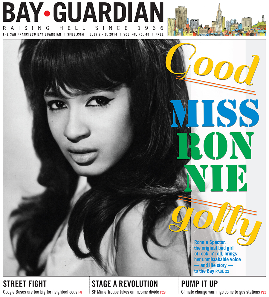
Good golly, Miss Ronnie

For the SF Bay Guardian's July 2 issue, I used a sassy file photo of Ronnie Spector from the '60s, plus a sassy typography treatment in summery colors for a cover that's both classic and playful ... in addition to showing off Ronnie's (wait for it) sass.

Read Emma Silvers' story on the original bad girl of rock 'n' roll here.

tags: Ronnie Spector, sail, SF Bay Guardian, cover, photography
Tuesday 07.29.14
Posted by Brooke Ginnard
 

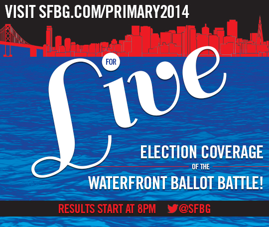
Election teaser

Here's a quick image I made for the SF Bay Guardian's social media channels, which teased its live election coverage June 3. The biggest issue this election was the waterfront, so I wanted that to be prominent. I recycled the water image from our endorsements cover, colored a city outline red and added white text for a patriotic feel.

tags: SF Bay Guardian, sail, advertising
Thursday 06.12.14
Posted by Brooke Ginnard
 

The treat sheet

I love this cover. It popped out of the stands. It's fun, summery, sweet, and really makes you want an ice cream cone. AND it was easy to make. 

Step 1: Find adorable photo of little girl eating an ice cream cone on your photo subscription service; realize that you have to find a way to use this image.

Step 2: Purchase a delectable ice cream cone from a local company that you want to feature in an upcoming food issue. (In this case, it's two scoops of lemon cookie and strawberry ice creams on a waffle cone from Three Twins — still highly recommended.)

Step 3: Hold cone, and have a partner photograph it.

Step 4: Eat ice cream. (My favorite part.)

Step 5: Use Photoshop to substitute the original boring ice cream cone with a photo of your delicious, locally made, publication-reviewed ice cream.

Step 6: Add a pink background, a snazzy headline font (yes, that's sail), and a subhead in a colorful geometric shape.

Boom!
tags: SF Bay Guardian, cover, Photoshop, sail
Thursday 06.12.14
Posted by Brooke Ginnard
 

Sail strikes again!

Oh Sail, how I love you. Here's the SF Bay Guardian's April 23 cover.

01-cover_SFIFF.jpg
tags: SF Bay Guardian, cover, sail
Wednesday 05.07.14
Posted by Brooke Ginnard
Comments: 1
 

Tenants take action

This cover concept stemmed from a bad piece of clip-art I saw. While the basic idea is the same — a circle of hands around a home — I had a lot of fun transforming that concept into something both beautiful and relevant.

The hand outline conveys individual openness and vulnerability, while the multicolored, transparent layering conveys unity, diversity, and strength in numbers — in addition to providing a fun, colorful visual element.

Using a multiunit building helps focus the discussion on tenants instead of owners, and the architecture is reminiscent of San Francisco homes.

And yes, I used the font sail again. I think we can all agree it's perfect.

Read the cover story here.

hands_cover.jpg
tags: SF Bay Guardian, cover, Photoshop, typography, sail
Thursday 02.13.14
Posted by Brooke Ginnard
Comments: 1
 

Sail

Remember a few weeks ago when I said I was obsessed with the font Sail?

Here's another example: the cover I designed teasing the SF Bay Guardian's July 2013 article on the America's Cup, comparing sailing culture in the U.S. with sailing culture in New Zealand.

Go ahead and get lost in the curves of that beautiful typography against a background of sail forms.

HighSeas.jpg
tags: SF Bay Guardian, cover, typography, Photoshop, sail
Friday 01.31.14
Posted by Brooke Ginnard
 

The secret life of Sylvia Fein

This week's SF Bay Guardian cover story highlights the life and work of local painter Sylvia Fein, who, at 94 years old, is continuing to create some of the best work of her career.

I can only hope that when I reach 94,  I'm as passionate, thoughtful and open to the world as Fein is.

Click here to read the article at sfbg.com.

"Black Eye," 2008, egg tempera on board, 5x7 inches, courtesy of artist Sylvia Fein and the Krowswork Gallery 

"Black Eye," 2008, egg tempera on board, 5x7 inches, courtesy of artist Sylvia Fein and the Krowswork Gallery 

To emphasize the secretive feel of the artwork and headline, I used two versions of the same typography — one in black and one in white — and edged the white out from underneath the black so that it's instantly legible, but has a hidden, mysterious quality.

Click here to download the font, "Sail," which is free for commercial use. (I'm kind of obsessed with it.)


tags: SF Bay Guardian, cover, artist, painter, Sylvia Fein, typography, sail
Thursday 01.16.14
Posted by Brooke Ginnard