Robert Trujillo, the mega-talented local artist I worked with for the SF Bay Guardian's 2013 Best of the Bay issue, is making a children's book!
Please check out his Kickstarter page, and contribute if you can.

Cover illustration for the SF Bay Guardian's 2013 Best of the Bay edition by Robert Trujillo

City Living illustration for the SF Bay Guardian's 2013 Best of the Bay edition by Robert Trujillo
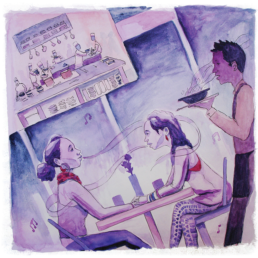
Food + Drink illustration for the SF Bay Guardian's 2013 Best of the Bay edition by Robert Trujillo
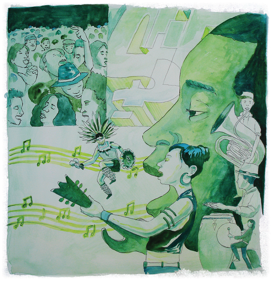
Arts + Entertainment illustration for the SF Bay Guardian's 2013 Best of the Bay edition by Robert Trujillo

Shopping illustration for the SF Bay Guardian's 2013 Best of the Bay edition by Robert Trujillo
