For the tech-savvy and the tech-averse — the SF Bay Guardian guide to riding out San Francisco's latest transformation:

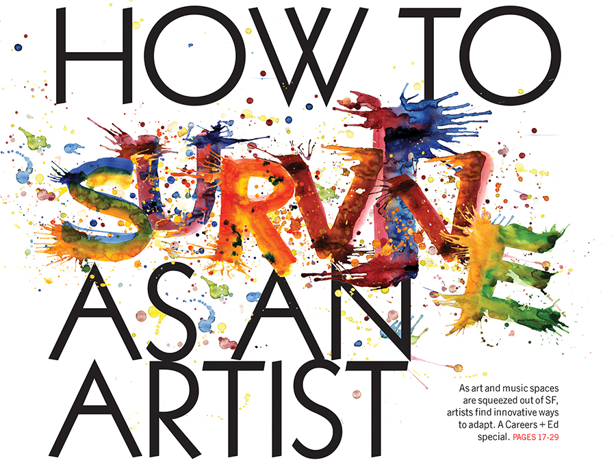
Paint splatter, I love you.
This anonymous clip-art genius stole my idea for making my own typography.
I wish I could use multicolored paint-splatter type every week.
Check out this week's Careers + Ed issue.
Om Nom o'clock
Putting this issue together, I was constantly hungry. Fuel your cravings here.
Circular food for the win!

Photo collage
As a part of research for her March 26 cover story, news editor Rebecca Bowe walked around the Tenderloin with photographer Mike Koozmin and talked with a few members of the homeless population there. Though few were willing to be photographed, the portraits Koozmin captured were striking, including one of "Mike," which I decided to use in a collage on the cover.
There were concerns about simply using the man's photograph on the cover, with editors feeling that the close-up, emotional portrait might both exploit his grief and make him a poster child for San Francisco's homeless population — to a much greater degree than it would if his photo appeared inside the paper.
The distortion of the collage allowed us to protect some of his privacy, while preserving the emotional impact on the cover. Plus ... I've been wanting to use this photo collage technique for a WHILE, and I think the effect is striking with this story. Read the article here.

Evolution of a cover
The cover for the SF Bay Guardian's Freedom of Information issue, which focused on Aaron Swartz, wasn't fully realized until the interior graphic feature was completed.
We knew we wanted to feature Aaron prominently on the cover, but have the focus be on the achievements and impact of his work. Illustrator Sean Morgan and I went through a few sketches before settling on the use of circular connectors and a thumbprint — two elements recurring throughout the graphic feature — to help connect the feature with the cover cleanly and vibrantly.


Illustration by Sean Morgan
The Saga of Aaron Swartz
Last week's SF Bay Guardian graphic feature on the life and work of Internet activist and icon Aaron Swartz, illustrated by Sean Morgan, reminded me how powerful art can be, and how much of an impact we can have when we think outside the box of traditional storytelling.
I met Morgan at a CCA Illustration Thesis Review I attended in December, where I was blown away by his black-and-white work ... and the fact that I was frantically searching for someone with exactly his talent to illustrate the SFBG's Candidate X issue — the fictional saga of a political superhero's emergence in San Francisco.
The black-and-white Candidate X was a success, and as soon as I heard the words "political graphic novel" in a planning meeting for the SFBG's annual Freedom of Information issue, I knew Morgan would again be a perfect choice. I was really excited to work with him again — this time in color — and create something impactful, relevant, and just plain fun to read.


Illustrations by Sean Morgan
What is yoga now?
This week's cover story "mines yoga's mythic past for clues about its vibrant present."
With that in mind, I used a striking image of an ancient yogini statue as the cover's main visual, which is offset nicely by the headline. I took an outline of a modern-looking female practicing yoga, and used transparent layers to create a background that both conveys both the present day and also, through the woman's repetition, evolution.

Stay gold
Here's a video I filmed while on-set at photoshoots for two of the 10 Goldies winners — Malic Amalya (film) and Brontez Purnell (performance/music).
The photoshoots were at Amalya's and Purnell's Oakland and San Francisco apartments, respecitively, and were photographed by Goldies vets Saul Bromberger and Sandra Hoover.
Purnell lent me a song from his band, The Younger Lovers, to use with the footage. Enjoy!
And here are the final portraits ...

Photo of Malic Amalya by Saul Bromberger and Sandra Hoover

Photo of Brontez Purnell by Saul Bromberger and Sandra Hoover
Silver Goldies
The Goldies (Guardian Outstanding Local Discovery awards) turns 25 this year, making this its silver issue.
Veteran photographer duo Saul Bromberger and Sandra Hoover — who have been photographing Goldies winners for 18 of the awards' 25 years — returned this year to deliver the amazing photo of masked DJ Nebakaneza for the cover.
Even though the cover photo was appropriately silver, I couldn't resist pouring gold glitter all over my desk, photographing it, and adding to the headline. Because this year, silver's also gold.

Photo of DJ Nebakaneza by Saul Bromberger and Sandra Hoover
Here's another photo of the cover star, because it's just too good:

Photo of DJ Nebakaneza by Saul Bromberger and Sandra Hoover
Tenants take action
This cover concept stemmed from a bad piece of clip-art I saw. While the basic idea is the same — a circle of hands around a home — I had a lot of fun transforming that concept into something both beautiful and relevant.
The hand outline conveys individual openness and vulnerability, while the multicolored, transparent layering conveys unity, diversity, and strength in numbers — in addition to providing a fun, colorful visual element.
Using a multiunit building helps focus the discussion on tenants instead of owners, and the architecture is reminiscent of San Francisco homes.
And yes, I used the font sail again. I think we can all agree it's perfect.
Read the cover story here.

Schadenfreude is sexy
I'll take any excuse to make a flow chart.
P.S. It's almost Valentine's Day.
Pick up a hard copy of this week's SF Bay Guardian and quiz all your friends with conspiratorial giggling.

Q's back.
And so is 8-bit. I want to make this background every week.
Put on Qbert's album, close your eyes, and imagine yourself running (not walking) through the original Super Mario Bros. game.
Trust me, it's the best kind of Thursday pick-me-up.

Sail
Remember a few weeks ago when I said I was obsessed with the font Sail?
Here's another example: the cover I designed teasing the SF Bay Guardian's July 2013 article on the America's Cup, comparing sailing culture in the U.S. with sailing culture in New Zealand.
Go ahead and get lost in the curves of that beautiful typography against a background of sail forms.

Photoshop is awesome


Because coloring
The best organization systems involve crayons ...

... because coloring.
Today's album: Childish Gambino's Because the Internet
Throwback Thursday
Today I'm paging through the SF Bay Guardian's digital archives for the paper's brand-new Instagram account, because it's Throwback Thursday #tbt
It's invigorating to see cover art that's still fresh and relevant, despite the 40+-year throwback.

So far the account is filled with SFBG covers (you're welcome), but I imagine our Instagram coverage will expand to protests, concerts and other events in the coming weeks. Follow along here.
Good tech
The SF Bay Guardian's Good Tech cover story was finally published today! We had first planned to print the issue in July 2013 (and I even commissioned this fantastic cover illustration by Matthew Fleming in late June) ... but that launch was hijacked by other, more timely stories, and by the abrupt departure of longtime SF Bay Guardian publisher Tim Redmond (now writing at 48 hills), who first envisioned the issue.
But I'm really happy the concept made a comeback, and the timing couldn't be more perfect.
In recent months, the tech industry has consistently been the scapegoat for San Francisco's changing neighborhoods and housing crisis, and the words "Google bus" are prone to incite a deluge of techie hate. Now more than ever, it's important to highlight the socially conscious tech workers, and the ways tech can aid government and solve real problems. All-encompassing anti-techie prejudice can hurt the city, because like all of us, geeks have the power to change the world. Let's get together, combine our resources and change it for the better.
Check out all five Good Tech articles at sfbg.com.

Illustration by Matthew Fleming
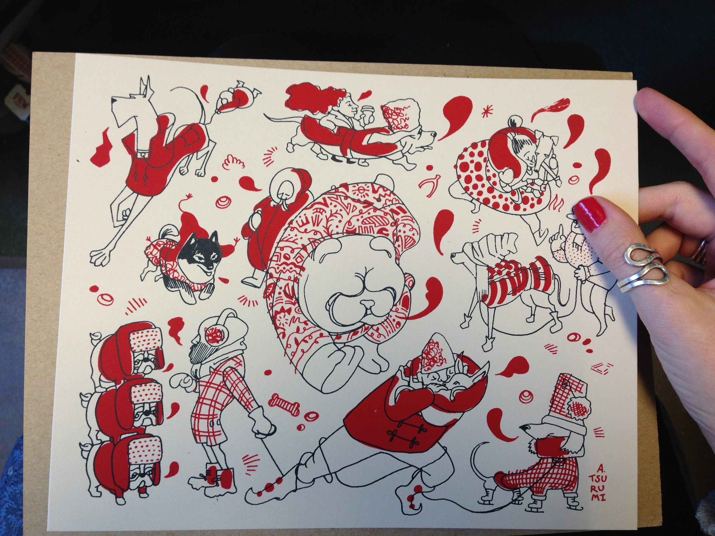
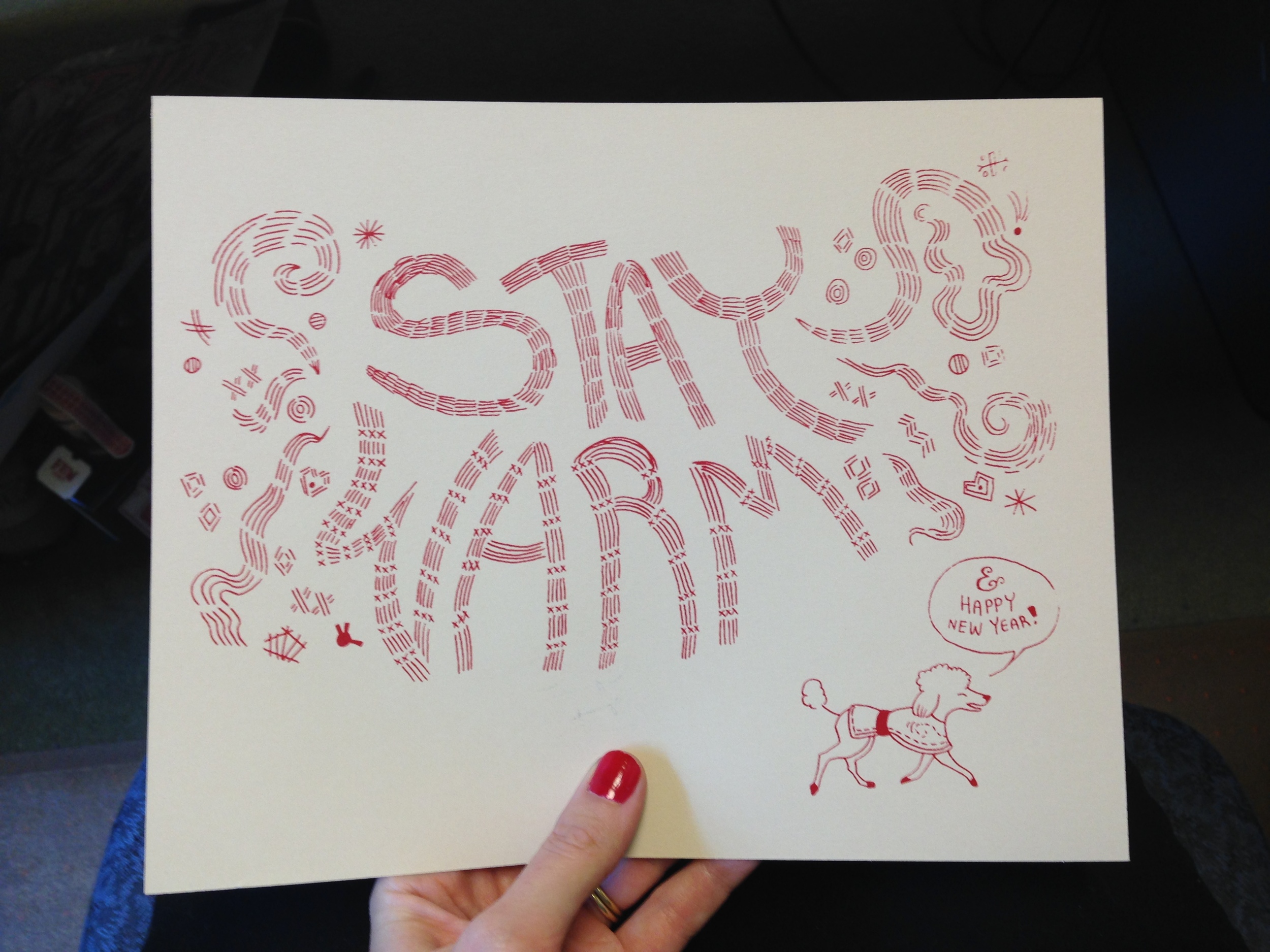
Stay warm
This arrived in my mailbox today from the wonderful Andrea Tsurumi.
Warm and fuzzy feelings all around.
The secret life of Sylvia Fein
This week's SF Bay Guardian cover story highlights the life and work of local painter Sylvia Fein, who, at 94 years old, is continuing to create some of the best work of her career.
I can only hope that when I reach 94, I'm as passionate, thoughtful and open to the world as Fein is.

"Black Eye," 2008, egg tempera on board, 5x7 inches, courtesy of artist Sylvia Fein and the Krowswork Gallery
To emphasize the secretive feel of the artwork and headline, I used two versions of the same typography — one in black and one in white — and edged the white out from underneath the black so that it's instantly legible, but has a hidden, mysterious quality.
Click here to download the font, "Sail," which is free for commercial use. (I'm kind of obsessed with it.)
The robots are coming!
Looking through file photos of vintage robots = best way to spend a cold day huddled in the office. This ladybot was a clear winner with her piercing blue eyes and fabulous 'do.
Winter needs more neon.
