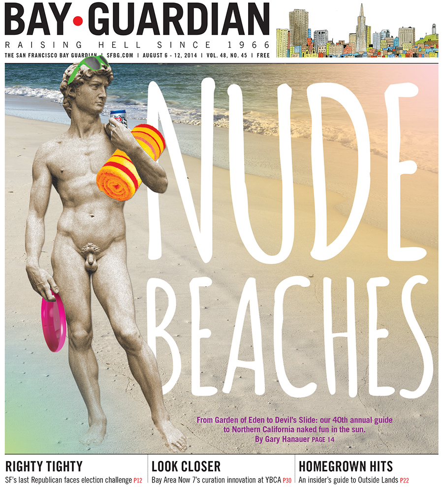
For the SF Bay Guardian's 40th annual Nude Beaches issue, I decided to transform an iconic nude image — Michelangelo's David — into a nude beachgoing bro.
I used Photoshop to transform the statue into a sand sculpture, and added modern neon props and colorful light leaks resembling an Instagram filter for a cover that's both a humorous allusion to an iconic work of art, and a parody on hipster culture.
I had SO MUCH FUN transforming iconic works of art in Photoshop ... despite the fact that putting a beer can in David's hand may be one of the most despicable things I've ever done.
WARNING: Past Nude Beaches cover photos, displayed at the end of this post, contain full-frontal nudity and are not safe for work.
Below are the cover photos from the past two years, both photographed by Matthew Reamer. (WARNING: NSFW!)
For the 2013 issue, I decided to experiment with nude typography. I gathered a group of friends (and friends of friends) to spell out the word "NUDE" on San Francisco's Baker Beach (the nude-friendly end, obviously), then used Photoshop to superimpose "BEACHES" on the sand below them.
The 2012 issue featured a photo of three people hanging out (literally) (sorry) at Baker Beach. It was the first time in the Guardian's history we were allowed to feature a penis on the cover, and we took full advantage. The cover photo attracted attention from Jezebel, whose online commenters also applauded us for featuring beautiful, real bodies.
Fun fact: The 2012 nude beaches shoot was the first photo shoot I ever coordinated for the SF Bay Guardian.

Photo by Matthew Reamer
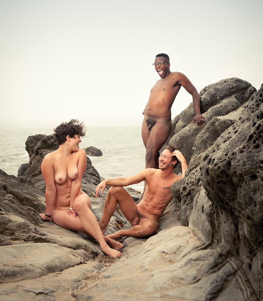
Photo by Matthew Reamer